VCD302 #6

VCD302 #6

This major project was a lot of work, but a really great experience.

In terms of the project outcomes:

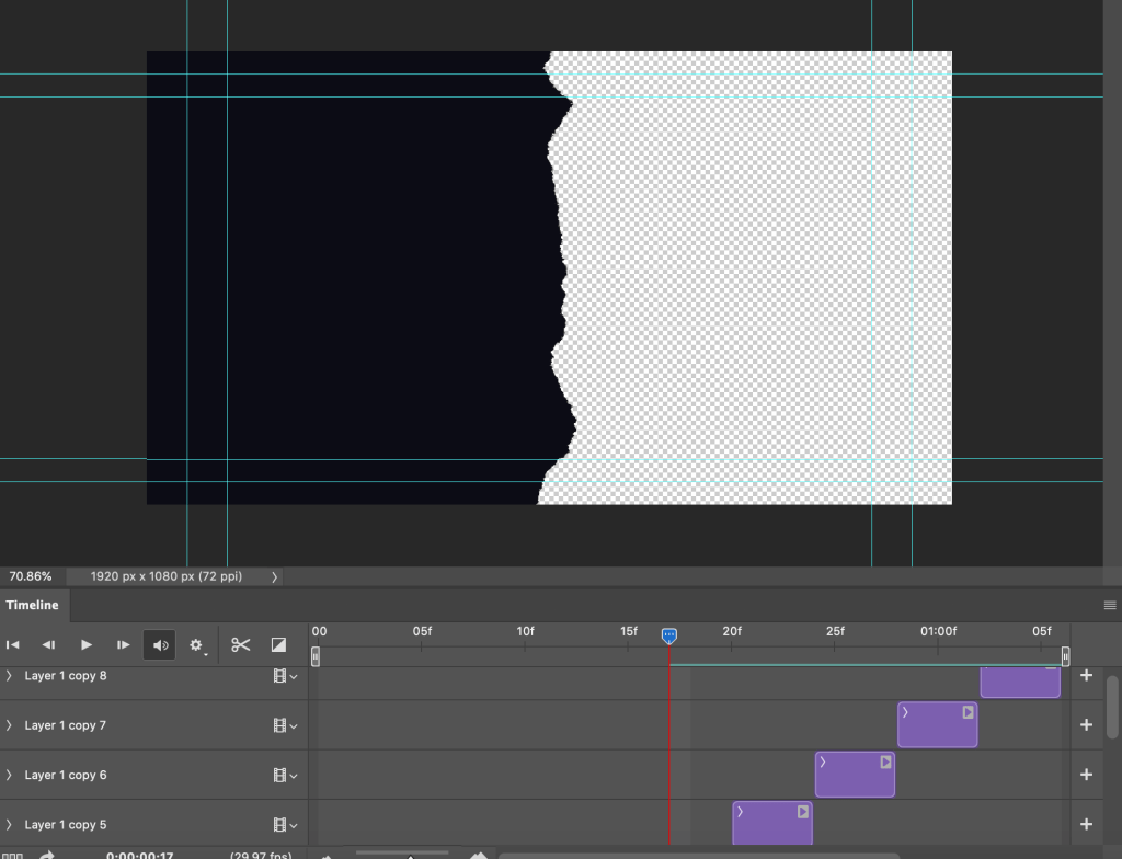
  • Technical achievement: Whilst I had experimented with tricker technical aspects such as noise and adjustment layers in the first motion design project this session, this project equally tested my skills. The creation of hundreds of layers within lots of compositions was a lot to keep up with. This was definitely an improvement on my nonexistent motion design skills at the beginning of the session.
  • Implementation of motion design fundamentals: There was a lot to take into consideration in regards to the principles and fundamentals of motion design. In terms of my project, there were many functions of primary motion. Temporal motion was used throughout the project as the compositions were timed in line with the “theme song” of the “show”.
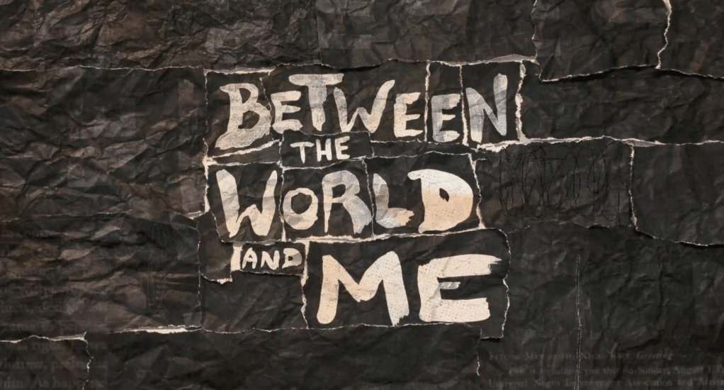
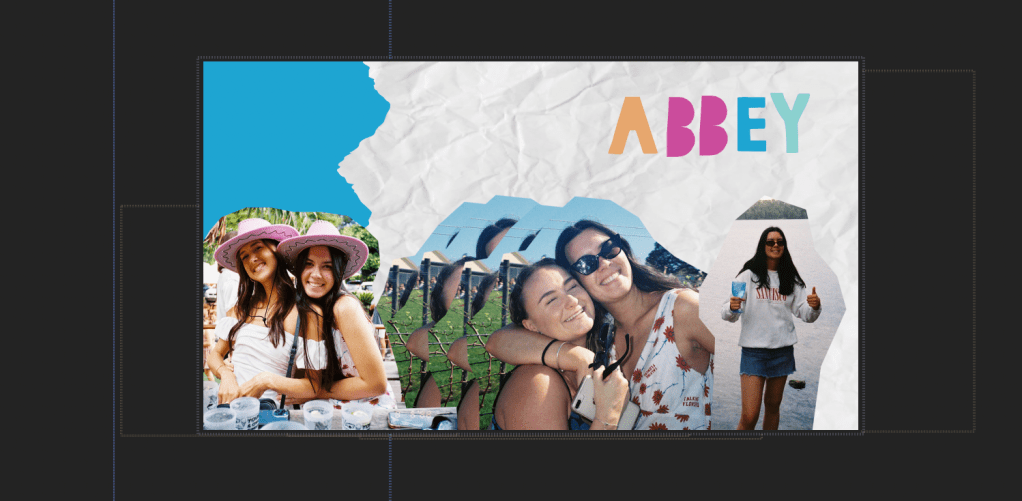
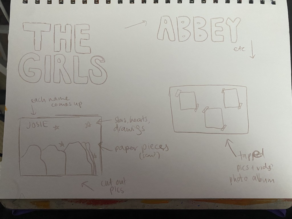
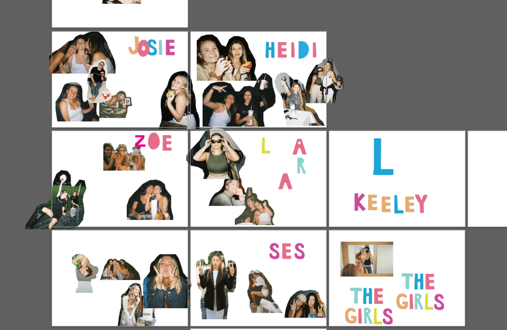
  • Design / aesthetic outcomes: A majority of the design and aesthetic outcomes set out in my original ideations were definitely achieved in the final project. A consistent theme was maintained throughout the full length of the title sequence created.
  • Project goals: There were a few more technical aspects I would’ve liked to incorporate into the project, but overall I’m happy with it as my first attempt at this form of motion design.

Learning opportunities/analysis: Whilst it may be considered an easy skill, one of the biggest breakthroughs of this project was learning about the “write on” component of the paint tool on After Effects. This effect had come up in different title sequences I’d studied in the research stage of the project and I had attempted to achieve it many ways before being shown how to use the paint tool. Another learning opportunity experienced during the production of this project was to make sure progress is being saved properly, especially after doing a 3 hour session on it, and when working between many devices…..

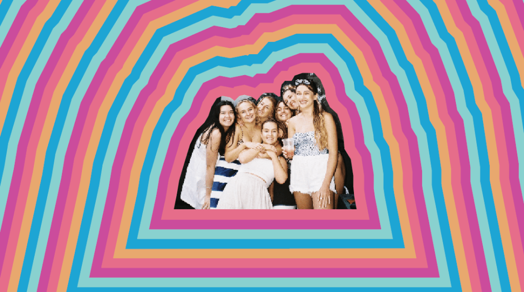
Another critical moment in creating this project was having to let go of the illustrative direction I wanted to take. This was heavily inspired by the title sequences that appear in the show, ‘Broad City’. After creating the elements needed for it, I found that it didn’t fit the style of the rest of the project, so decided to let it go. This is an important lesson in design, as sometimes it’s ok to let things go if they aren’t meshing well with the rest of a project.

Future: I’m definitely keen to further my motion design skills after this session. My next project will be a video of my trip to New Zealand, which I’ll be enhancing with some the technical forms displayed in this project and that I’ve learnt throughout the session. I’m also interested to try and expand my skills on creating mixed media projects, as this is where I got a lot of inspiration from for this project. Working on this project has also inspired me to include more motion design in the work I do outside of university.

VCD302 #5

VCD302 #5

In terms of the 7 stages of Ambrose and Harris’ Design Process model , here is how my project is progressing. 

DEFINE

The define stage is crucial in design. It establishes the “who, what, when, where, why and how” of a project (Ambrose & Harris, 2009, pp. 16). I was a little bit slow in defining my project, but eventually decided on creating a title sequence for a fake show starring my friends and I. I knew the design style I wanted to implement into my project, so this was explored further in the research stage of the design process.

RESEARCH

The research stage of the design process aids in the creative process involved in ideation. Research consisted of watching title sequences and pulling out ideas from each one that I wanted to recreate or inspire certain aspects of my project. The most influential for me were the end credits for Wild Child (2008) and the title sequence for Between The World and Me (2020)

https://www.artofthetitle.com/title/between-the-world-and-me/

This studying of title sequences, which we had also conducted during the earlier weeks of the session, really opened my eyes to the amount of production and work that goes into these pieces. This was something I hadn’t really given too much thought to prior to taking VCD302. Upon further research, I read about how title sequences are seen as a space for experimenting with different film techniques, and will usually take on a different form and aesthetic to the film/television show that follows (Allison, 2015). This is definitely something I will be noticing now when I watch films and TV shows.

Research also consisted of watching YouTube tutorials and taking instructions from tutorials and lectures to see if I would be able to execute my ideas. Some of the most important takeaways from this research was finding different ways to replicate handmade aesthetics digitally such as using Photoshop brushes to create paper rips and transitions between After Effects compositions, and to use roto brushing techniques using the Pen tool on After Effects to draw on compositions (thanks Wes). 

IDEATE

Next up in the 7 stages is ideating. Ideating includes things such as brainstorming, sketching, which is what I did. I began by creating sketches and drafts in Illustrator of different aspects of my project. This included choosing pictures and cutting them out, hand drawing text and creating vector shapes, and creating colour palettes. 

PROTOTYPE

This stage is where I started experimenting and testing what I could do with my ideas. In particular, I was keen to test my ideas for transitions based on what I’d seen in the ‘Between the World and Me’ title sequence. They had used different forms of paper ripping and folding to move between scenes. I found a tutorial on Youtube in my research and followed it to create two different transitions.

SELECT

The select stage is where decisions need to be made in terms of what will make the final project. For me, I had to decide if I would continue with certain elements I had planned to include in my original ideations. This meant leaving out things such as the more illustrative aspects of my project, which I would not have time for, and would not match with the style I had established in other parts of the project.

IMPLEMENT

Once I’d completed each of these steps in the process, I began to implement my process into my final project.

LEARN

Overall, I’ve learnt a lot from working on my project. Some of the things I’ve learnt include:

  • Moving elements from Illustrator and Photoshop over to After Effects
  • Making transitions on Photoshop and After Effects
  • Rotobrushing and using the Paint tool 

References

Allison, D, 2015. ‘Film Title Sequences and Widescreen Aesthetics’, Film International, vol. 13 (4), pp. 6-19

Ambrose, G & Harris, P, 2009. ‘Design Thinking’, AVA Publishing

VCD302 #4

VCD302 #4

In one sentence, my motion design project is a title sequence for a fictitious television series featuring my friends and me. 

FUNCTION

I will be mostly exploring mixed media designs as an area of investigation in this project. This will come from the use of photo and video, as well as hand drawn components. Through the exploration of mixed media, I will also be looking into how to recreate this style through digital techniques such as Photoshop brushes and filters, and the use of rotobrushing in After Effects. 

PRODUCTION TECHNIQUES

In terms of production techniques, I will be using a mix of personal film photography, videos,  and other scrapbooking/collage aspects and vector graphics and text which will be hand-drawn and then traced in Illustrator. 

After gathering all these elements together, I will put them into After Effects to form my motion design project. Adjustment layers and noise may be used to create a more homemade feeling to the title sequence I am creating. The use of keyframing will be essential to create movement in my project. 

I will be using the pen tool to rotobrush on the compositions I create to add to the handmade feeling of my project. 

Photoshop will be used to add filters to pictures, as well as to create “paper rip” transitions. 

EXAMPLES

I gathered a lot of inspiration from various title sequences. 

The first that my project will be the most influenced by (and loosely based on) is the ending credits for the film ‘Wild Child” (2008). This has really inspired the use of personal film photography and video, as well as the scrapbook/collage aesthetic of my work. I also really wanted to explore roto brushing techniques, similar to what is used in this.

I also really liked the hand-drawn illustrations and colour palettes used in the title sequences for the show ‘Broad City’ (2014-2019). I have begun creating something loosely based on some of the title sequences featured in seasons 1 and 2 of the show. I’m not sure how much of this will make it into my final project, but it’s definitely been an inspiration. 

Finally, I also really liked the use of mixed media in the title sequence for the film ‘Between the World and Me’ (2020). The use of the ripped paper transitions throughout the title sequence inspired me to create my own version to incorporate into my project. 

The title sequence can be found on Art of the Title: https://www.artofthetitle.com/title/between-the-world-and-me/

These techniques are also used in the title sequence for ‘Godfather of Harlem’.

STORYBOARD

After gathering all my inspiration, I started creating storyboards and rough drafts of what I’d like to create within my project. My final project may look completely different, but it’s good to have some sort of direction to start from. 

VCD302 #3

VCD302 #3

Task 1 is complete! I was overall happy with my work and proud of how I managed to develop my After Effects skills within the past 7 weeks. 

Artivive Trigger Image / Poster

In terms of the project outcomes:

Technical Achievement: My project is set in three parts. The technical difficulty of the majority of my project is pretty simple. Key frames were something that took me a while to get used to but obviously makes up a majority of the movement within my animation. The final part of my project which features a moving 4 colour gradient was the most difficult part to create. I followed this YouTube tutorial to help me achieve the final product. It helped me learn how to use new effects which really enhance animations made in After Effects. 

Implementation of Motion Design Fundamentals: There was a lot to take into consideration in regards to the principles and fundamentals of motion design. In terms of my project, there were many functions of primary motion, but secondary motion didn’t play much of a role. This is something I’d like to work on for my next project. Whilst there was no music used, temporal motion was crucial to my design. In terms of Disney’s 12 Principles of Animation, I particularly used 5 and 9. 

Week 3 Lecture Slide

Design/Aesthetic: The design and aesthetic of my project are a bit chaotic. My original inspirations in the ideating stage were kaleidoscopes, so that contributed to the bright colour use and range of scale and rotation that featured in my project. Key frames played a major role in the constantly changing colours, rotations, shapes, sizes and opacities of my project. 

Learning Opportunities 

I originally had an idea to include a moving marbled aspect to my project as I wanted the movement in my animation to be more fluid than the examples we’d been shown. I watched another YouTube tutorial on how to create this. I wasn’t happy with the final product so I decided not to include it in my project. This is something I definitely want to attempt again to learn the skill. 

Another issue of my project was that I created the middle part, which features the squiggly circles, first. I really wanted to incorporate it into my project so I worked backwards for it to fit amongst the other parts. This is something I struggled with and will definitely not be working like this for future projects.

Future

I’m excited to use the skills I’ve learnt in Task 1 for the next assignment, but also for my own projects. I enjoy making little montage videos of holidays etc. so I’m keen to enhance those with some new effects. I never could’ve imagined the background work that goes into the final product of animation so the process has been really fascinating and it’ll be cool to start from scratch again and come up with something new. 

VCD302 #2

VCD302 #2

In terms of motion design fundamentals, primary motion is definitely what makes up the majority of my work. I’m yet to really work on secondary motion but will see how my project develops in the next week. 

Creating motion design projects like this has us “thinking in layers” (Krasner, 2013, pp. 414). The amount of layers it has taken to create what I have so far in After Effects has been a bit overwhelming, but is something I’m getting used to. Within these layers, I’ve been trying to incorporate some of Disney’s 12 Principles of Animation. So far number 9, timing, has been crucial throughout my process. I’ve also created some aspects with number 5, follow through and overlapping action, in mind. 

This project has really sent us back to the basics of graphic design. As discussed by Lupton & Phillips, “point, line and plane are the building blocks of design”. From these three things, we can create pretty much anything. It’s been interesting to see how such simple elements can take on so many forms and come together to create motion projects like this. 

The work I have so far is bright and a bit messy. I’m using a lot of different colours and trying different things with scale and rotation. I have two main experiments that I am hoping to incorporate into my final project. One of these experiments is a four colour swirling gradient I created. I created this using a tutorial I found on Youtube. This really tested my technical skills in using After Effects but it was a good learning experience. The other experiment I have are these 3 layered circles which I have made wavy using a wave warp. This helped me learn how to use key frames as I had to set up 9 different shape layers to move, wave, change colour, expand and lose opacity in time.   

Screenshot of my gradient
Before applying the wave warp
After applying the wave warp, rotation and colour change

I haven’t really done a whole heap of visual research outside of what we learn through the lectures and tutorials. My inspiration is definitely based around kaleidoscopes though. After seeing the examples of previous students’ work, I wanted to create something with lots of colour and changing forms and shapes, which is exactly what a kaleidoscope has. However, what I have created so far is definitely only loosely based on what a kaleidoscope actually looks like.

References 

Krasner, J. 2013. Motion Graphic Design : Applied History and Aesthetics 

Lupton, E & Phillips, J C. 2008. Graphic Design : The New Basics

VCD302 #1

VCD302 #1

Both the title sequences for “Altered States’ and ‘The Dead Zone’ feature a technique used by title designer Richard Greenberg in much of his work. The secondary motion occurring on the screen appears as though the camera is panning out, with the type on the screen slowly becoming a lens for the imagery playing (Landekic, 2013). Whilst the title sequence for ‘Stranger Things’ does not feature imagery like ‘Altered States’ or ‘The Dead Zone’, a similarity can be seen in the secondary motion of the camera panning out to display the title at the end of the sequence. 

Temporal considerations can be seen across all three title sequences. The use of eerie, unsettling music and slow, sliding movements of type creates a feeling of suspense for the audience. The ‘Stranger Things’ title sequence works particularly well with the soundtrack, with the primary movement of type coinciding with the beat of the music. This was able to occur due to the soundtrack being set prior to the creation of the title sequence (Perkins & Landekic, 2016).

The title sequence for ‘Stranger Things’ is heavily influenced by film titles of the 1980s. Creative director Michelle Dougherty took inspiration from ‘Altered States’ and “The Dead Zone’, which were favourites of the creators of Stranger Things, the Duffer brothers. In regards to the typography of the title sequence, the typeface used is ‘Benguiat’ which directly references the typefaces found on the original covers of Stephen King novels such as ‘Carrie’ and ‘Needful Things’ (Perkins & Landekic, 2016). 

Image: https://www.artofthetitle.com/title/stranger-things/

Optically created motion design holds qualities that cannot be recreated in the digital age unless it is done on purpose. In the process of creating the title sequence for ‘Stranger Things’, Michelle Dougherty studied the imperfections that featured in title sequences created in the 80s. These imperfections include but are not limited to discolouration, flickering of lights and jagged movements (O’Falt, 2017). 

These characteristics can be seen through many projects created before digital motion design. It can be seen in the title sequence for ‘The Dead Zone’, where I noticed some of the “jumpiness” of type as it appeared on the screen. Michelle Doughtery wanted to recreate some of these features to enhance the retro feel of the ‘Stranger Things’ title sequence, so residual colour was added in places where the type on the screen fades up and down (O’Falt, 2017).

BCM313 Reflection

BCM313 Reflection

Whilst I actually really loved the content I learnt this session, I’ll be glad to see the end of it! This year has taught me that online learning definitely does not suit my learning style, or procrastination habit, so I have my fingers crossed we are back to face-to-face next year.

BCM313 was a great subject to take, and I’m so glad I chose to do it this year. I have never taken a subject before where the staff were so helpful and caring, and the other students were so engaged and kind. It was really refreshing compared to other subjects I’ve done in the past. I really appreciated how understanding and accomodating everyone was of each other’s circumstances.

In regards to the content we’ve actually learnt in the subject, I’ve come away from the session feeling more confident in what the future of work may look like for myself and others. It’s also helped me reflect on my own experiences and values within the workplace, which I think is really useful and important. I also really enjoyed the assessments we were set, which was really surprising.

A big shoutout to Kate, Nhi and my class for their contributions to making this session bearable, I really appreciated it!

BCM313 Presentation Reflection

BCM313 Presentation Reflection

For my presentation, I decided to interview my dad, Greg Doyle. Reflecting on the whole process of this assignment, I really enjoyed it. I learnt a lot about my dad I didn’t know, and enjoyed presenting and receiving feedback from my peers.

Throughout his career, my Dad has had lots of experience in different jobs, industries and volunteer positions. This has always been really inspiring for me, as I still don’t know what I want to do when I finish uni. Dad also liked to remind me throughout our conversation that he still “doesn’t know what he wants to be when he grows up”, so I can definitely see a similarity between us there.

Dad is currently the General Manager of Wollongong City Council. He is also a co-founder of The Public House Collective and Australia’s Oyster Coast. When I asked him about his journey up to current role as General Manager, he told me:

“I don’t think it’s actually about education. It’s about life experience. It’s about exposure to a variety of different professional and personal experiences”.

Greg Doyle

In his case, he obtained a Bachelor of Science (Geography) in 1993 and a Master of Policy (Social/Public Policy) in 1997 from UOW. However, in his words, he credits the experiences he gained as a disability accomodation support officer with House with No Steps whilst completing his first degree, and the volunteer roles he has had in areas such as childcare, arts, tourism, sport, research and disability services, as major contributors to him achieving the role of General Manager last year.

Looking back on our whole conversation, the thing that stuck out the most to me was definitely Dad speaking on his most important values. The values he highlighted were:

  1. Having courage. “The courage to speak up when something isn’t right or the courage to raise a new idea to people”.
  2. That having integrity is everything and he strives to be a genuine leader. He expanded on this saying that he “would never ask someone to do something I wouldn’t be comfortable doing”. 
  3. Delivering on promises. He explained that if he said he’ll do it, he’ll do it. or he will not make the promise and explain why he isn’t able to. 

After I presented, a question came up from Nhi that made me reflect on these values. I realised that these values were something my Dad also practised in his personal life, and they had also influenced me in my personal and professional life.

I also noticed this with a few of the other presentation’s in the class. Other people had also interviewed one of their parent’s or another family member. The way they spoke about their relatives really highlighted to me how the people who are closest to us can have a strong influence on our personal and professional values, as well as inspire our future careers.

Overall, I was really happy with the feedback and questions I received from my peers and tutor, Nhi, and was happy to expand on what I had learnt from speaking with Dad. A comment about my own storytelling ability and how I was able to clearly relay my conversation with Dad and his stories to my peers was also really nice to receive and I really appreciated it.

Throughout our conversation, aspects of what we have learnt in BCM313 came up, which was completely unplanned on my behalf, but was cool to see what we learn in this subject in real life situations.

Dad brought up that “yarning” or “storytelling” are really important in the workplace. He has met so many people from different walks of life in all his experiences and has gained so much knowledge and understanding by simply talking to people and getting to know them.

He also brought up what COVID-19 has done within his workplace and how it will impact the future. COVID-19 has meant that a lot of Dad’s work has had to become more flexible and adapt to the use of more online platforms to connect the workplace. As Dad explained this has actually made Wollongong City Council, and himself, “more accessible than ever” to people who may have not been able to reach him before due to geographical or physical inaccessibility.

I came away from the conversation with my Dad, and the assignment as a whole, really happy. I was able to catch up with Dad and learn more about him, and then reflect on this experience and how it impacted me. It also made me feel a lot better about my own indecision about my future, as well as the future of work.

BCM241 Pitch

BCM241 Pitch

In my previous blog posts I have narrowed my field site, planned my approach and discussed my background research and ethics. This comes together to form my topic, which is Australian indie music, specifically where and how people discover music within the genre.

Digital Artefact:

My digital artefact will feature content posted to TikTok, with supporting content on Spotify. I will be making TikToks that feature Australian indie bands and artists and my music recommendations. I’ve found lots of new indie music on Tiktok recently but it is predominantly American and British. This means there is already a demand for music content on the app, and an opportunity to introduce more Australian artists. I will then accompany my TikToks with Spotify playlists including the featured artists and additional music.

I chose these two platforms as I believe they are two of the most accessible platforms right now to discover new music, and have both been ways I’ve recently found lots of new music. I also think creating content through these platforms will help me immerse myself even deeper into the community and inspire me to find unconventional ways of discovering new music to feature in my content.

Questions:

There are a few particular questions I’m looking to answer through my auto-ethnographic study. These include:

  • Where and how do listeners of Australian indie music discover new music within the genre?
  • What are the most unique ways people have discovered some of their favourite bands and artists?
  • What kind of stories come with discovering different artists? Are there similarities between fans of the same artists?
  • Does the way you discover an artist impact on the engagement you have with them? (eg. are you more likely to become a big fan of a band by listening to them on Spotify or in a live setting first?)